Wednesday, 7 March 2018

Evaluate my Initial Footage


Framing- The difference between these two shots is that in the original shot, the frame is showing the model's knees, whereas in our shot the model's knees are not in the frame. I think the professional shot is more successful, because they would have spent more time filming the shot, whereas we only did it one or two times. 
Lighting- The lightning does not really work, as you cannot see the model's face properly. Also, the colours of the top and skirt are supposed to be seen, whereas on this shot they are blending in together. We did not try to do any special set up, we just decided to use the lighting that was in shot location. Due to the lights, we can see the reflecting of the classes in the background. 
Mise en scene- The skirt choice was similar to the original shot, but we could have had the model wear a checked shirt to match the model in the original shot. 
Camera- in our shots we used a hand-held camera. In our shot it looks like the shot was not filmed on an eye level, it almost looks like the model is looking down a bit. 
Actors- the actor worked well while doing the shot.

Friday, 23 February 2018

Textual Analysis for H&M's Close the Loop campaign

"Wear a short skirt after 40"- In this scene, there is a close up of the lady, to show that she is old. Then the camera pulls away into a high angle shot, this is to show all the ages and ethnicity together. This scene has a lot of emphasis on the old lady as she is the main focus if it, as she is laying on a bed with white sheets, when she is wearing black clothes, with a big gold necklace. It suggests that she is liberal and progressive, meaning that she is open minded about ages and ethnicity.It also suggests that the H&M as a retail shop has no barriers between ages and ethnicity.

"Try to hard"- In this scene there is a white woman, who has a lot of jewelry on and and clothing that make her stand out, as she is doing an everyday thing. They use a low angle shot, to make her look like she is in control, it also makes her look like she is confident and composed. We then see a close up of her face and we can see that she is wearing bright red lipstick. It could have been any other colour lipstick but she decided to wear red. The colour red has a very high visibility, so it is like the woman chose it so people can pay attention to her. The colour represents joy, sexuality, passion, sensitivity, and love. It is also a symbolic sign of femininity and strength.

"Wear a hat indoors"- In this scene, there are two black women, who are walking into a restaurant, even though we cannot see their facial expressions, we can tell from their walks that they are in confident. Then there is a long shot, where one of them is sitting down and the other is standing on the chair, making her look like she has authority. We can see how there are two people in the hot wearing white, whereas the two black women are wearing black, but they have things that make them stand out, such as the red hats and the white/black sunglasses. We can see that they are looking straight into the camera, more like they are looking at the audience, which makes them look like they are superior to everyone else in the shot.

"Dress like a man"- In this scene. there is a woman who is crossing the road, more like she is modelling while crossing. But the thing that catches the audience's eyes is that she is wearing men clothes. This is significant because it suggests that fashion has not rule on what type of clothes people wear, whether the clothing are for boys or girls. At the end of the scene she makes a facial expression, this might suggest that even if she is a girl, she can still wear men's clothing.

Wednesday, 21 February 2018

Textual Analysis

Through the whole video campaign, there is non-diegetic sounds. These are sounds that the actors in the video cannot hear. There is a voiceover, which sounds more like a narrator. The narrator is Kate Tempest, who is a performance poet. In this specific video campaign, you can hear from her voice that she is performing a poem. While she is talking there is a soundtrack that is being played in the background, the soundtrack goes really well with the narrator's voice, as if there is a rhythm going on. 

There is also some diegetic sound, these are sounds which has a source on-screen, for example, in some of he scenes you can hear the ripping of the clothes which are worn by the actors. In the forest scene where there is a girl leaning on the tree, you can hear bird's songs and leaves, these are synchronous; which are sounds that are expected with what is being viewed. This scene is much slower that the other scenes, as if it was done deliberately to show the ethical side of the campaign. 

In the scene where there there is a boy and a girl in a restaurant, there is a smooth tracking shot showing the boy the who has spilled his food on his white t-shirt. There is another smooth tracking shot at the very beginning of the campaign, where there is a girl who is sliding towards the camera, but the camera is also moving to her smoothly. There is also some long-shots and close-ups, the main shots are when there is a girl in the middle of the street wearing a dress that stands out. Then when there is a guy who is wearing the same dress, we are shown a close up of the guy's chest hair.

The video campaign has a lot of mise en scene, such as props. The props that are use in this video are mostly clothes and most of those clothes are taken to clothing factories, so that they can make more clothes out of them. At the very start of the video, there are balloons, this is so that it set the scene of the party. We know that it is a party because there are people dancing, and also because of the balloons on the walls. There are quite a few locations, such as houses, the lake, forest, restaurant, beach and the streets. This video clearly shows the fashion conventions and the ethical conventions of the campaign. Mainly every model shown are people who are the same ages as the target audience, this is so that the target audience can see their age groups recycling their clothes, so they will automatically decide to the same thing as them.                                                                                                                                                                                                                                                                                                                                                                                                                                                                                                                                                                                                                                                                                                                                                                                                                                                                                                                                                                                                                                                                                                                                                                                                                                                                                                                                                                                                                                                                                                                                                                                                                                                                                                                                                                                                                                                                                                                                                                                                                                                                                                                                                                                                                                                                                                                                                                                                                                                                                                                                                                                   

Friday, 26 January 2018

Statement of Intent

VOGUE BY RUE 

For my fair trade company 'Vogue by Rue', I intend to create a marketing campaign which shows the ideologies of fair trade. I have decided to add flowers as the main representation of my brand, this is to show the fair trade, natural and ethical side of my company.

Behind all the flowers that will be used, are flowers that are made in Tanzania, Ethiopia, Sri Lanka, Ecuador, Uganda and Kenya, which i will purchase from shops that work with fair trade. The flowers that i will purchase are Alstroemerias, spray roses and normal roses. I will be using them not only to advertise the clothing that will be worn by the models, but also the flowers themselves. For my two main shots, I will have one of my models standing in front of a flower bush. For my other shot, my other models will be standing in a garden centre, with the flowers that i will purchase, placed around them, on the floor.
  
I chose the name 'Vogue' because of the magazine, which features things about fashion, beauty, culture and lifestyle. Also 'Vogue' is the place that everyone wants to be if they want to be in the world of fashion. For the photo shoots, I will have three models for my brand, two girls and a boy. Half of the shots will show the natural elements of the brand. Then the rest of the shots will focus more on the clothing, that the models are wearing. The clothes that will be worn will be high end brands, such Adidas, Nike, Puma, Calvin Klein, Supreme, etc. Also the target audience will be able to purchase the clothes from high end clothing shops, such as, Urban Outfitters, Topshop, Zara, Selfridges & Co, etc. 


My target audience will start from the age of 16 years old to the age of 25. To show this, I will use fashionable models who will appeal to the target audience. My target audience should be aware of fair trade before purchasing the products, and they should want to help the fair trade community. 


Monday, 15 January 2018

Pre-production Research

MARKETING FASHION


H&M  promote their products by standing out from other high street fashion brands. In the video above they are encouraging their audience to recycle their clothes, so they can be reused or recycled through H&M's garment collecting initiative. H&M are trying to make a difference in the fashion industry by making it fun, by making fabric fibers out of the recycled clothing. 
Social media is also a big influence of how H&M and other high street fashion brands promote their products. The more followers they get the more people that see and purchase their products. 


Topshop gains genuine endorsements with the press due to their continuous drive to set high goals for themselves and constant innovation. The main focus of their marketing campaigns is making them bold,  an example being Vogue Catwalk Guide. The campaigns Topshop produce, for example including Cara Delevingne comply with their cool, quirky image as she is a vibrant, unique character herself. 


URBAN OUTFITTERS 


Friday, 12 January 2018

Fairtrade Research

Fairtrade is a simple way to make a difference to the lives of the people who grow the things we love. They do this by changing the way trade works through better prices, decent working conditions and fair deal for farmers and workers in developing countries. 


These are some of the products that Fairtrade produces:
Chocolate-  Fairtrade helps to make cocoa farming in places like Ivory Coast and Ghana more sustainable by guaranteeing minimum prices and providing a premium to invest in local communities, so farmers can provide a better future for themselves and their families.

  • Cadbury- Cadbury Dairy Milk has been Fairtrade since 2009 and was the first mainstream chocolate brand to become Fairtrade certified.
  • M&S- M&S offer 8 different flavours of Fairtrade chocolate bars which are available in store and as part of their online gift offer. 
  • Sainsbury's100% of Sainsbury's Taste the Difference single origin white, dark and milk chocolate are Fairtrade. 

Bananas- bananas are grown both on small family farms and much large commercial plantations. The banana industry provides employment for thousands of people in Latin America, the Caribbean, Southeast Asia, and West Africa. It generates vital foreign exchange earnings that governments depend on to improve health, education, infrastructure and other social services. 


  • The Co-operative- the first UK supermarket to sell Fairtrade bananas and first to sell it in all stores. Today all their bananas are Fairtrade. 
  • Waitrose- waitrose is the first retailer to sell 100% Fairtrade bananas. 
  • Sainsbury's- Sainsbury's was the first major UK supermarket to convert its bananas to 100%  Fairtrade in 2007. 
Fairtrade campaign to raise awareness of the needs of producers in developing countries, convince people of the good reasons to buy Fairtrade products and to persuade policymakers to change the fundamentally unfair trade system. 

Wednesday, 13 December 2017

Explain how the political context in which newspapers are produced, influences their ownership and regulation.

Explain the political significance of the concept of 'press freedom' and its relationship to representative democracy. Why do you think freedom of the press is important? How much influence do you think the government should have about the things reported in the UK press? (1)

The use of free press has both positives and negatives, and therefore shouldn't be totally self-regulated. The invasion of privacy of those in the public eye is becoming more common, with reporters taking stories too far and gaining private information. This is happening due to the demand the readers give, responding well to stories that seem exclusive. However, I feel that when  scoop is no longer in the public interest then it shouldn't be printed and hence should be regulated, as reporters are gaining both unwanted information and information which is too invasive. The concept of 'press freedom' has political significance as newspaper are able to support any political ideology, printing stories backing this ideology. Due to this, even though the government has little control of the press, politics remains one of the most covered topics. This relationship between 'press freedom' and it's political significance helps to represent the democratic society in Britain; allowing readers to chose which ideology, and therefore newspaper, they follow and buy, without any regulation against them. Just as everyone is entitled to an opinion when voting for the future of the country, with the majority gaining power. Also the government should oversee what is covered within the press, though it should not be able to control; what can and can not be published. The press should be covering stories and events with the public interest as a priority. 


How are newspapers regulated and why do you think this is necessary? Can you refer to an academic idea we have studied in class? (2)

The main organisations that regulate newspapers consist of: Editor's code of practice, Press Complaints Commission (PCC), and the Independent Press Standards Organisation (IPSO). This is necessary so that newspaper companies are protected by these organisations so that stories are checked to make sure there is no obligation to those stories which could harm the company involved if there was a problem with story coverage. Curran and Seaton argue that ownership and regulation is the most significant factors in how the media operates. This contributes to the media not having a broad range of opinions and perspectives as companies such as News UK own multiple news outlets which leads to the same opinion coming from the same person being put out into the media, this comes from a capitalist structure, newspapers such as the guardian are ran by trust boards and not by one person so their news comes form a wider perspective and has less bias. 

What examples of editorialised content would not fit 'impartial' television news (e.g. social or political opinion) from The Guardian and The Daily Mail print or online editions.) (3)


Editorialised content means that its not advertising based in the act that they pursue direct sales intentions. This is the reason in which customers purchase or subscribe to these news outlets. News outlets of this type manipulate and distorts news values in order to broadcast impartial judgements of peoples beliefs and what they want to hear. 


What examples of ownership models, e.g. The Guardian’s trust ownership and The Daily Mail’s proprietor model, could show the opportunities offered by the latter model for control by ‘press barons’. (4)


Ownership models like the Daily Mail's proprietor model offer a prime example of how media can be controlled to influence public political views. Press barons like Rupert Murdoch, who controls most of the UK tabloids, can be seen to share his political opinions in each of his newspapers; thus allows for an unfair opinion to be shared with the UK.

How much power does the press have to shape political debate, e.g. the influence of proprietors on politicians to support policies promoting cross-media ownership or holding back from regulation. (5)

The press can develop power through ownership of newspapers which consequently can shape political stances due to their ideologues and therefore political debate through the widespread circulation which has the power to influence politicians in their debates. The owners of newspapers can influence the editorial stance of a newspaper. Newspapers will also attempt to influence how the public vote in elections. It is important that newspapers stick to a code of conduct or rules set out by independent organisations in order to avoid this. If one large business or one singular man owns a company their ideologies can filter down into the papers. This relates to Hesmondhalgh's theory on cultural industries as DMGT (owner of the Daily Mail) also owns multiple other companies. This therefore shows the integration and conglomeration of cultural industries which follows the normal capitalist patterns seen in Hesmondhalgh's theory. 


Explain the political affiliations of the two newspapers, e.g. The Daily Mail as a right wing newspaper is partly defined by its support for the Conservative party, The Guardian as a centre-left newspaper is partly defined by its support for Labour or the Liberal Democrats, and how this is clear from an example you have studied. (6)

To begin with, the Daily Mail is a clear right wing (capitalist) newspaper, which evidently portrays these views through its stories and layout. The Daily Mail tends to have a great focus on money and prices in modern life - even when not especially relevant to the story. The Mail does this because of its political affiliation, due to the wealthy being interested in the price of things. Another point, is that the Mail favours right wing people and the wealthy, which is clearly shown in their bias to some stories. An example of this, was the paradise papers coverage, which involved the queen being under fire for not paying tax and also for the elites dodging tax. In this, the Mail back up the queen and made it as if those lesser off were wrong, and the queen was simply a victim. 

In contrast to the Mail, we see the Guardian adopts left wing (socialist) ideologies because of its support for labour. The Guardian is very much a hard news paper, and so what it conveys tends to be less biased and more factual. Despite this though, there is a slight lean in what it has written towards the socialist side of things, and so the rich tend to look worse. Interestingly, the Guardian also says a lot about tax at the minute, though what it says is how the rich should really help the poor, and so they should be taxed a greater amount. 


Monday, 4 December 2017

Analysing Shelter's Advertisements

In this advertisement poster, the advertisers have chosen the colours black and red, to portray their campaign. The colour red connotates with blood, danger, action. It symbolises action and is linked to anger. Red is a very emotionally intense colour, it has very high visibility, so it is good at catching people's attention. The colour red, brings text and images to the foreground, meaning that it will be the first thing that an observer will look at. The colour black connotates with fear, grief, aggression and mystery. Black is a good contrasting colour, as it contrasts with any colour. When combined with red, which is a powerful colour, it also gives a very aggressive colour scheme. The advertisers might have used the colour black to show the seriousness of the campaign. The reader can also see how serious the campaign is by the facial expressions of the actors. The colour white is also used, the colour white makes people feel safe, so the advertisers are trying to show that if people donate money to the charity, then those people will be helping others feel safe. Each poster shows a different challenge that can affect the security of people's homes when personal situations change, such as losing a job and the impact of paying off debts. The poster is urging people to seek help early, because a lot of things can happen that will affect them badly. 

Media Representation: Unseen Advertisement

Shelter vs Amnesty International 


One similarity is that both posters are charities and they are trying to warn people and they are trying to help people. Another similarity is that they both use he colour red. Red is the colour of blood and it is associated with rage, danger and wrath. It is an intense colour that is packed with emotions such as anger and violence. The amnesty international poster uses barb wire to show that there is a lot of war and conflict in the world, that people feel imprisoned or are imprisoned. Amnesty is trying to stop this by showing that if people donate money then they can stop the cruelty and violence, hence why there is barb wire and a hand which is trying to cut it. One difference is that, the Shelter poster's purpose is to help those people who have lost their homes to find shelter quickly. Whereas the amnesty international poster's purpose is to stop cruelty and violence in the world.

Old Spice Analysis


The poster itself is directed to men, because it says " smell like a man, man". Even though the product is for men, the video campaign itself is directed to women. It is shown that 70% of women purchase men toiletries, instead of women toiletries. The product is shown as an oyster that has two tickets inside it, then it turns into diamonds, then it shows the actual product. It says that anything is possible when your man smells like Old Spice instead of a lady. Which suggests that the campaign is trying to make women buy the product for themselves, instead of buying it for men. The campaign shows an attractive man, telling the female audience that if they purchase the product, their man would be able to smell like him 

Analysing Lucozade's Advertisement


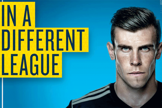
They have put a blue background because the colour of the drink is blue. Also when people think of the colour blue, they think about the sky, water and stability. Water represents that the drink is refreshing and that it will keep you hydrated and help maintain endurance performance. The background shows two shades of blues, there is a light blue, which connotes with health and a dark blue which connotes with power. The advertisers show that the drink does not only keep you hydrated, but its good for your health and it gives you a lot of power. The yellow in the poster represents the energy that generates in your muscles when you have a drink of lucozade. The yellow is very effective for attracting attention, that is why it is used to highlight the most important elements of the poster. The yellow on the poster is associated with freshness, to show that the drink is fresh. The dark navy blue that is used for the font, connotes with power and seriousness. 
The background of the poster goes from dark to light, then you can see that there is light on most part of Gareth Bale's face but then there is not that much light on the right side of his face. 
'In a different league'→ this might mean something about football, because Gareth Bale is a well known footballer. So it can be taking about the Premier League or the Championship League. So the advertisers may suggesting that if you drink the lucozade drink then you will be in some type of special league. 

Audience Profiling

Audience profile for Deutschland 83 D83 has a demographic audience of: ABC, middle class/upper class/working class. The demographic would...